The Premier League title for Leicester City in 2015/16 is the most crazy story I have even seen in my life. The point is, HOW crazy are they? Can we measure it?
We are in Champions League, man! Dilly-ding, dilly-dong! Come on!
– Claudio Ranieri, Leicester City Manager
Today I would like to present a new metric, namely True Performance(TP), to enable measurement of each football team’s performance in every single season. It helps to compare and visualize performances between different seasons, leagues, and teams of different powers and potentials.
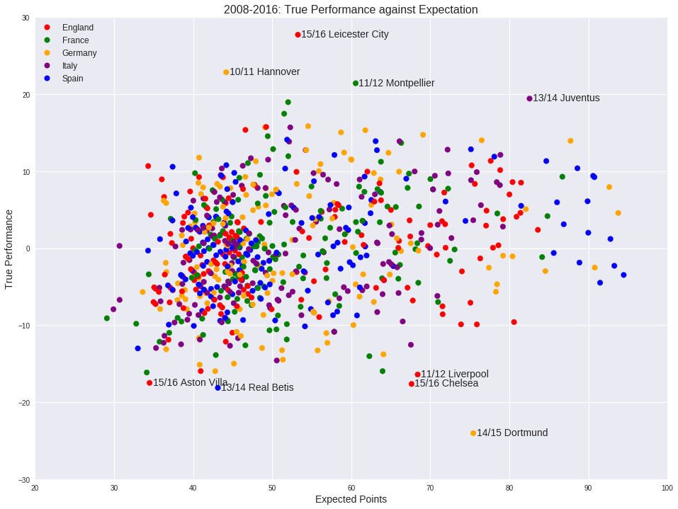
The following scatter plot presents all the TPs of the best European leagues, including EPL, La Liga, Bundesliga, Serie A and Ligue 1, from 2008 to 2016.
Model explained
- True Performance(TP) describes how team T performs in season S based on its external expectations.
TP = (Actual points for T in season S) - (Expected Points for T in season S)
- Expected Points(EP) represents the expectation of team T(by bookmakers) in a season.
EP = sum(Single Game Expected Points for T in each game played in season S)
- Single Game Expected Points(SGEP) same as EP, but the expectation in a single game.
How do we calculate SGEP for home and away teams in a single game? An example would tell.
- Bayern Munich hosts Borussia Dortmund at Allianz Arena. The definite Bet365 odds are H 2.00, D 4.00, A 4.00.
- SGEP for Bayern: 50% prob to win 3 points + 25% prob to draw 1 point = 1.75 points.
- SGEP for Dortmund: 25% prb to win 3 points + 25% prob to draw 1 point = 1 point.
For each game played in the five leagues from 2008 to 2016, SGEP for home and away team are calculated with outcome probabilities transferred from decimal Bet365 odds.
Plot explained
- X-axis: EP. Powerhouses are on the right. Small clubs normally appear on the left.
- Y-axis: TP. Teams exceeding expections are on the top. The opposite at the bottom.
Outperformers
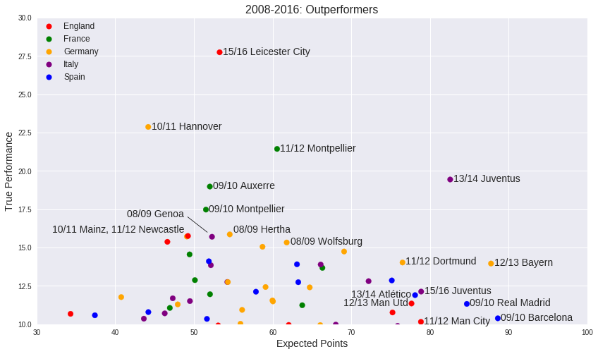
15/16 Leicester. We all know the story but wow. Despite some massive upsets and jaw-dropping winning streaks, they are still expected to be a pleb 54-points team. That converts to somehow 8th place in the Premier League table. No, no Champions League per voi Signor!
The other team I would like to mention is Juventus in 13/14. They are expected to be a 82-points, title-winning team, but scoring a whopping 20-plus TP over such a high expectation is just insane.
Les Misérables
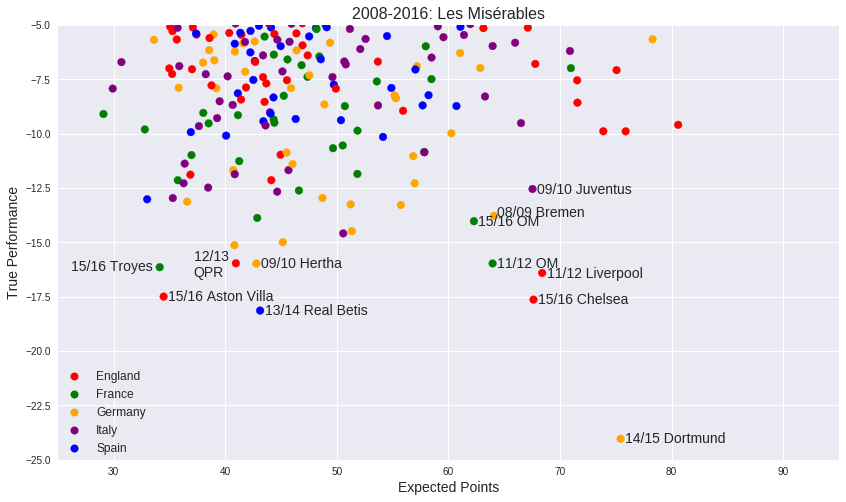
Oh well…Dortmund. Jürgen Klopp’s side did put two 10-plus TP seasons back in 10/11 and 11/12, but this time they got a trouble - Robert Lewandowski left for Bayern Munich in the ‘14 summer. Ciro Immobile was secured from Torino FC but he couldn’t run and score as good as Robert. Consequently their opponents realized it’s ok to give up possession since Dortmund is no longer good at creating space. By January they are deep in the relegation zone.
Notes
This model is a quick improvisation just for fun. Outliers are what we care about in this plot, so I leave out all other annotations to highlight the outliers.
Too many annotations could be annoying. I tried to mark with team badges instead of colored dots, but unfortunately it’s not supported in matplotlib. In the R-based ggplot, it works.
Reference
Source code is hosted on GitHub and Kaggle. I have some ideas to further this study, but not equally many weekends to do so.
Database by Hugo Mathien
An inspiring kaggle kernel by Yoni Lev