Seaborn is a Python visualization library based on matplotlib. It provides with themes, color palettes, and high-level built-in plot patterns to prettify your statistical graphics. But it’s not omnipotent as well.
Following are the best practices(that I could figure out) with seaborn.
Simply import seaborn
It’s really important to remember that seaborn is based on and provides interface for matplotlib. Once seaborn is imported, the default aesthetic setup for matplotlib plots will be overridden by seaborn.
So the very first way to use seaborn is to simply import it.
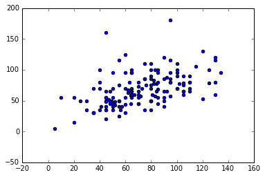
Using only matplotlib:
import matplotlib.pyplot as plt
plt.scatter('Attack', 'Defense', data=pokemon)
Then we import seaborn and try again:
import matplotlib.pyplot as plt
import seaborn as sns
plt.scatter('Attack', 'Defense', data=pokemon)
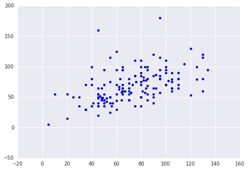
It looks better without any sophisticated configurations.
hue and color palettes
hue is a powerful parameter in seaborn. It simplifies the classification and coloration (if you want to) steps that you need to manually set up in matplotlib.
Using only matplotlib:
# create color mapping
color = ['navy', 'limegreen', 'red']
mapping = dict(zip(pokemon.Stage.unique().tolist(), color))

# define apply function
def color_mapping(row):
    return mapping[row['Stage']]

# apply
pokemon['color'] = pokemon.apply(color_mapping, axis=1)

# plot
plt.scatter('Attack', 'Defense', data=pokemon, c='color')
Now with seaborn:
sns.lmplot('Attack', 'Defense', data=pokemon, fit_reg=False, hue='Stage')
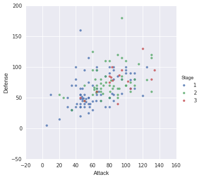
Wait, wait, wait. How did you configure colors in seaborn? Magic?
Nah, I haven’t done yet. With sns.set_palette() you can set the default color palette for all plots. There are some built-in palettes available and this one is my favorite.
sns.set_palette('colorblind')
sns.palplot(sns.color_palette())

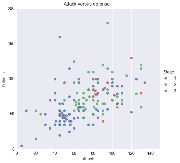
Customizing with matplotlib
Seaborn are equipped with some high-level complex plot functions such as lmplot, jointplot, violinplot and swarmplot. When using them, it’s easier to configure axis, ticks, lims, titles and labels with our old-skool matplotlib commands.
sns.lmplot('Attack', 'Defense', data=pokemon, fit_reg=False, scatter_kws={"s": 80}, size=8, hue='Stage')
sns.set(font_scale=1.5)
sns.plt.xlim(0, 150)
sns.plt.ylim(0, 200)
sns.plt.xticks(fontsize=14)
sns.plt.yticks(fontsize=14)
sns.plt.xlabel('Attack', fontsize=14)
sns.plt.ylabel('Defense', fontsize=14)
sns.plt.subplots_adjust(top=0.94)
sns.plt.suptitle('Attack versus defense', fontsize=16)
Flaws
Unfortunately, we can’t configure marker size with matplotlib anymore. In seaborn we can only pass float value, But in matplotlib we can pass a list and define marker size according to each data point instead.
So again, seaborn is good, but is good under specific circumstances. Before you switch to seaborn, think twice.