The Premier League has been the most entertaining football league in the last decade. Darkhorses, derbies, upsets, busts and at least four title contenders make it a great show every single season. I continued my research on the European football dataset to check out who comes atop at Premier League in the golden era.
I am the happy one. – José Mourinho, 2013 with Chelsea
I am the normal one. – Jurgen Klopp, 2015 with Liverpool
Why Premier League is the best
When I made this post: How Crazy is 15/16 Leicester City? I was impressed by the fact that no Premier League teams could enjoy a season expecation over 85 points. There isn’t such a team in Italy as well, but Serie A is plagued with match-fixing scandals so bookers tend to be very cautious with them.
Survivors
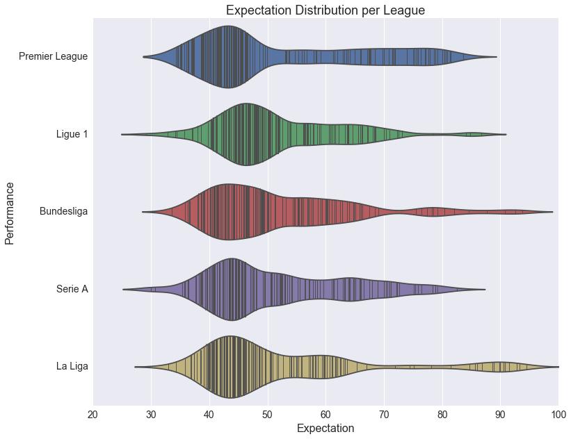
Over the last 10 years, team expectations in the major European leagues are plotted as above. Most of the teams are expected to collect 40 to 50 points every season. There are two exceptions: Ligue 1 and Premier League.
Ligue 1 teams have a better chance to collect plus-45 points. The French league is famous for crazy plays and darkhorses - almost every season you could see a ‘mediocre’ team that was expected to fight for relegation ends up in the Champions League. Auxerre, Bordeaux, Montpellier, and most recently Nice, … are among the best surprises from Ligue 1.
However, those Premier League teams fighting for their lives are not as lucky. They have a better chance to collect minus-40 points. This is due to the huge skill gap between the top 4 or 6 teams and the rest of the league. They don’t really stand a chance when playing against the best teams so those games against other relegation candidates are decisive. INTENSE.
Victors
At the pinnacle of the European football ecosystem, those giants are always expected to win 70 points every season. In France there is one named Paris Saint-Germain. In Spain there are Real Madrid and Barcelona. In Germany there is Bayern Munich. Borussia Dortmund can’t catch Bayern, but they successfully keep the other teams at bay. In Italy it’s not that evident but Juventus has been winning 6 in a row(well, for Italian football, there isn’t much to see from the odds).
But in England, there isn’t a single team that could dominate year in, year out. In the above plot we can see the expectations are evenly distributed from 62 to 85 points. It’s fairly simple: you had a great season, the expectation will go up. You played like shit, the expectation plummets.
Who has the highest expecations?
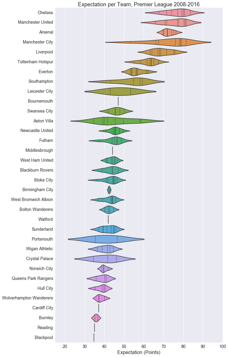
As we can see most of the top teams went through ups and downs but Arsène Wenger’s Gunners remains stable (at 4th place mostly). Manchester City had a power spike. Liverpool did the worst among the ol’tyme goods in the last decade, which is probably one of the darkest era in the club’s history.
The middle class teams are absent in the Premier League. Tottenham is catching up with the best teams, leaving only Everton and Southampton having forever plus-50 points expectations but absolutely zero hopes running for the title.
Performance in a glance
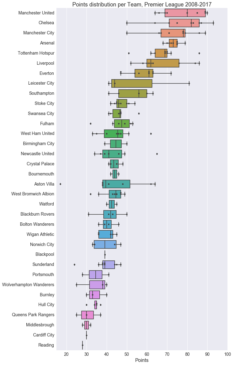
Talking about zero hopes for the title, Leicester won it all with only 81 points. It’s a bit unfortunate for Tottenham, as Mauricio Pochettino’s side reached prime last season and collected 86 points, but without any trophies.
In general, Manchester United did the best thanks to Sir Alex Ferguson. He led his not-the-most-talented team to numerous hard-fought championships.
On the other side of the league, Aston Villa’s 17 points season was a nightmare. Blackpool was unlucky though, they squeezed 39 points out with a low-budget team but was eventually 1 point shy to stay in the top flight.
Notes about seaborn
I did the analysis simply to try out violinplot and boxplot with seaborn, and it turned out to be great. Those are highly built-in functions facilitating distributional plots.
violinplot is more of a predictive plot. It comes with integrated KDE fitting and require a sufficient number of data points to be efficient.
sns.violinplot(x='exp', y='nm', data=epl_df, inner='stick', scale='width')
On the other hand boxplot is less predictive, but reflects well the dataset. The grids on the box are lower quartile, median, and upper quartile respectively. The whiskers are the extreme points within 1.5 IQR of lower and upper quartile. Isolated points are out of the 1.5 IQR range. Combined with swarmplot, you could have a good read on overall and individual characteristics of the dataset.
sns.boxplot(x='real', y='nm', data=epl_df)
sns.swarmplot(x='real', y='nm', data=epl_df, color='.25')
Reference
This project is hosted on GitHub, and is to be continued.
Database by Hugo Mathien