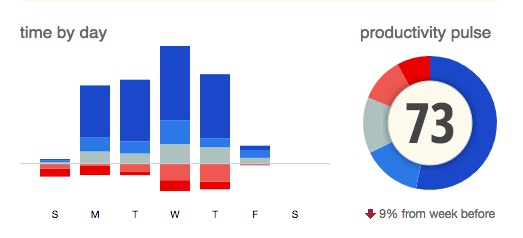
Recently I started tracking my time on computer with rescuetime. It summarizes and categorizes your working patterns, but as a data-scientist-to-be, there’s much more work to do, obviously.
Sankey diagram
Inspired by a reddit post, I was able to create a sankey diagram of my own:
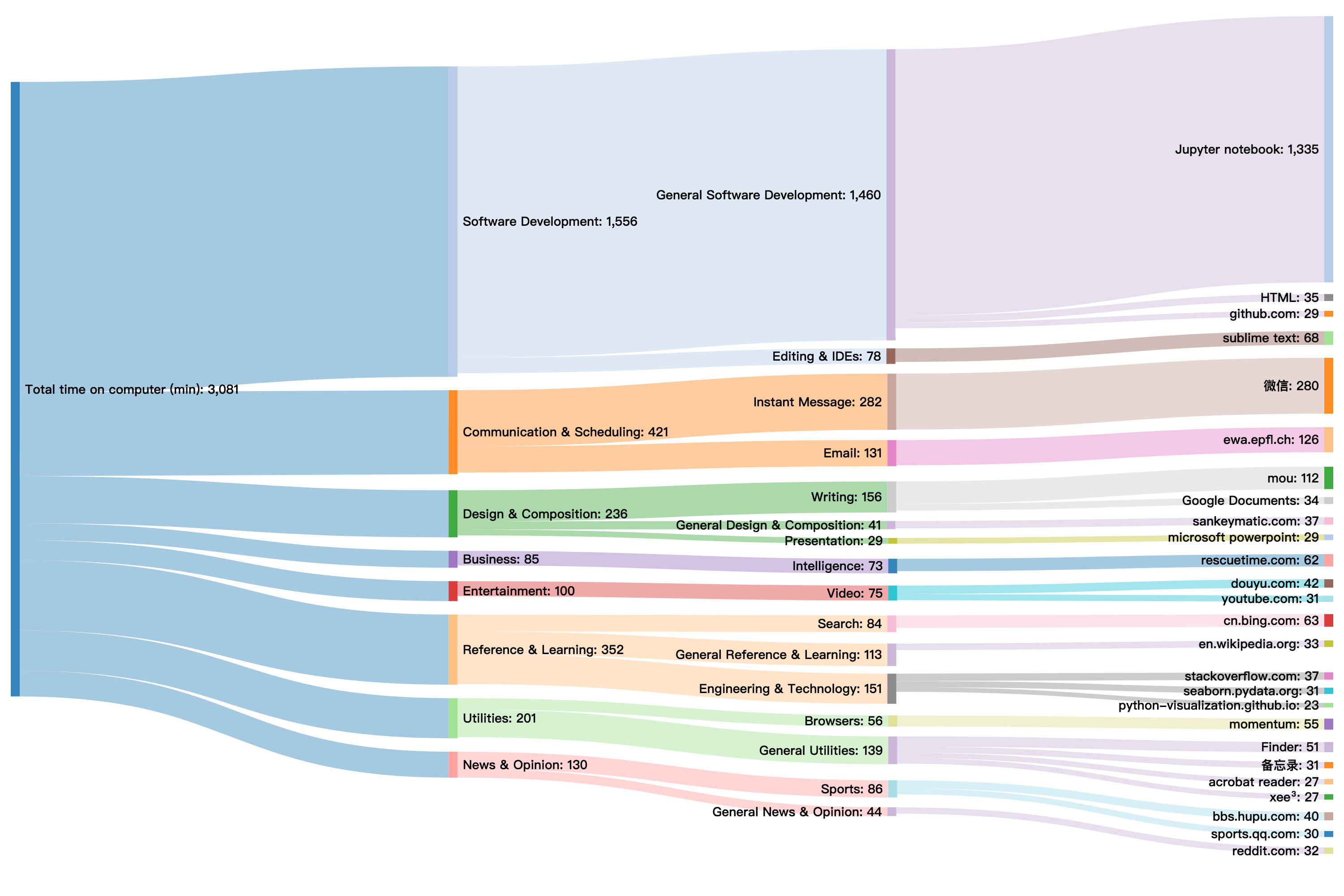
The data was collected over a 9-day span from December 14th to 22th, including 7 workdays. I have a deadline this week so I did more programming and less entertainment and gaming.
I could average less than 4 hours per day writing code. And for each hour I coded, 13 extra minutes were spent to look up references and documentations. It looks like my python skills are not that great yet.
I would do another version in six months and hopefully I could keep up with the trend.